First Light
Architecture

The fundamentals of the design devised by James KM Cheng Architects for First Light began with their careful study of its location within Seattle at Third and Virginia. At the macro level, this corner site can be interpreted variously as being at the eastern edge of Belltown, the northern edge of the downtown core, or at the southern extension of South Lake Union. Without doubt, this crucial corner site is subject to influence from all three of these key zones of Seattle’s urban core. From the start, Cheng felt a tower here needed to be restrained in its massing and detailing, not addressing just one of these adjacencies, but all of them. This represents a significantly greater design challenge than shaping a typical building.
At a finer grain of understanding this locale within the city, Third and Virginia is an unusually prominent location, being one of those places where Seattle’s urban grid shifts, slightly. By virtue of this block pattern change around it, the site can be seen many blocks away when looking west along Third Avenue, and also from downhill, when looking up Virginia from the Pike Place Market area. The design team began thinking of this as a turning point, as one of those places where the city shifts, meaning that simple design discriminations of what is “front” and “back” or “prominent” and “subordinate” could not be made. This urban situation meant that First Light’s corners would have unusually prominent architectural features, requiring a true building in the round.
JKMC Architects has envisioned ingenious design features in response to these considerations. The design team wanted to avoid a monolithic presence; using the same elevation treatment on all four sides would not work within the urban grain of Third Avenue and the Pike Place Market area. It was decided that the elevations would change as they went up, zones with differing details and palette to break the uniformity, creating visual interest and reducing the apparent mass of the tower. Residential suites with larger balconies were grouped together at the corners in blocks of multiple floors on the west and south elevations, their surface color a more prominent band of white. Moreover, this white banding would wrap around these prominent corners, alternating as they go up. That this detail communicates onto the exterior of the building the differing residential unit types within is a feature typical of the updated Modernism that is the core design philosophy at James KM Cheng Architects.
Many of the decisions regarding the building’s composition were driven by its immediate context. Early on it was decided that about one fifth of First Light’s floor space would be devoted to office space. The adjacent brick YWCA Building and many other neighbors are five to eight stories high. This became the cue to set the First Light office block’s height, a wider building mass, which serves as a podium for the residential floors above. Moreover, this allowed the amenity decks for the office component to look out onto neighboring Belltown’s historic roofscapes, with partial views out to the harbor and the Olympics, an apple orchard planted there to bring a natural element into the built environment. John Hogan’s “veil” of strung glass disks beaded on cables set outside the windows of the office floors have several functions. As the views from these lower floors are mainly out towards parking garages and brick walls, the glass artwork also serves to both diffuse views and increase privacy within. From the outside, the slight movements of the glass works forms an utterly contemporary elevation and a series of luminous sculptural moments shrouding the podium in soft, multi-faceted displays of light.
James Cheng’s design for First Light echoes the Chicago high-rise pioneer Louis Sullivan’s promotion of a tripartite composition rule for tall buildings. Inspired by design of columns from the Greco-Roman tradition, Sullivan proposed that towers should have a base, a pillar, and a cap, or capital. Conforming to this logic for the composition of tall buildings, at First Light, the retail and office podium are the base, the many floors of residential suites form the pillar and the penthouse and resident’s amenity floors that blossom on levels 46 and 47 are the capital. At the top of the tower, Cheng’s cantilevered swimming pool with wood-grain printed aluminum panels covering its soffit, supported on huge V-columns provides a distinctive addition to the Seattle skyline. This up-top massing provides a strong horizontal line that masterfully terminates the rise of vertical lines up through 47 stories, whether viewed from the sidewalk below or from across the city. This same concern with proportion and beauty informs all other exterior details, down to the most minute detail.
Like the tree-topping large nests that provide homes to eagles, the rooftop at First Light will become a haven for its residents, one which will fast emerge as a symbol for a new way of living downtown. Visible from around the city, the composition of a living green wall, secret rooftop garden, and a fine steel mesh wrapping around is composed and elegant. These, in addition to the amenity rooms shrouded in glass, make for a carefully resolved ensemble as climax to the tower. Through-out his career, James Cheng has elected to design small and medium scale private residences. These skills are evident in the finesse of First Light’s spectacular top floors, which will update the notion of a landmark tower in dialogue with the iconic Space Needle, with which it aligns, in many senses of that word.
In devising a palette of materials appropriate for First Light, James Cheng’s design team drew inspiration from Seattle’s long tradition of craft and invention, from the marine workshops lining the Ship Canal to Boeing’s factories, the simple but improvised concrete sheds of the Pike Place market and the futurism of Seattle Center. The JKMCA organizing philosophy was to use building materials and finishes in the most direct form possible, in contrast to the artificiality of overpolished design. Concrete is exposed wherever possible, its formwork markings left in place. This includes inside residential suites, where concrete columns are typically boxed-in with surrounding wallboard, reducing usable space. In the view of the architects, residents appreciate this reminder of the larger building in which they reside, providing a touch of the aesthetic of downtown lofts, rather than hotel rooms. James Cheng’s firm has been praised over the years for careful space planning considerations like these, making every corner and square inch usable, evident even when examining the floorplans of the smallest suites.
The lobby will present more like a gallery, with polished concrete walls, a floor and concierge desk of honed basalt, and a ceiling of smoked, polished stainless steel, all bathed in a wash of light that will emphasize the custom Fazioli piano and John Hogan’s artwork. To emphasize the openness of space, in-floor windows set within this concrete floor will provide views to the bicycle storage room below. Matte black panels leading residents to the elevators will be finished with jade onyx panels and terrazzo interiors. The cast concrete structure and V-shaped pool supports at the rooftop amenity level are similarly direct and exposed. With this, the composition of the building balances horizontal elements with vertical ones. “Light as a Common Thread” applies to even the simplest of architectural details, like the edges of balconies. The building is clad in pre-manufactured structural glass panels, detailed to visually evoke the aesthetic of a continuous wall. Authenticity and directness in architecture – like minimalism in the visual arts – seems inevitable when experienced, but requires great care in conception and construction. First Light’s dedication to an architecture of amenity coupled with a lack of artifice will inaugurate a new class of residential buildings for a changing Seattle.
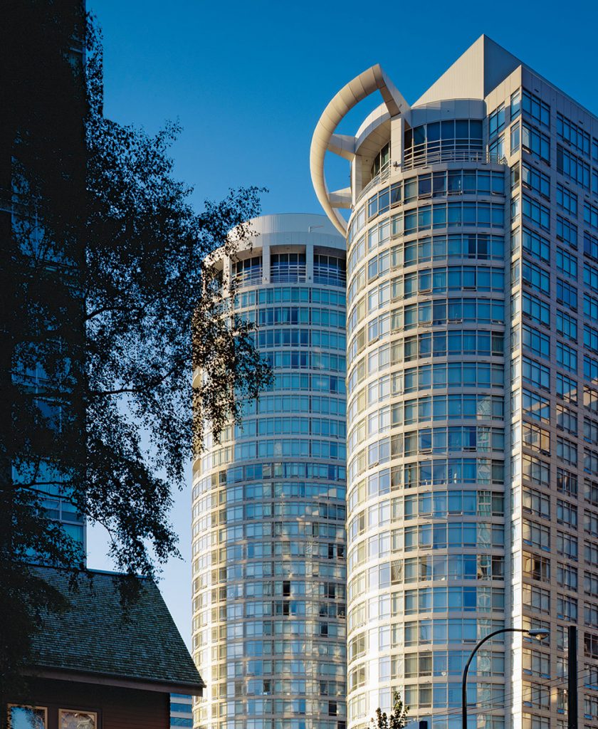
The Palisades was an important first for Westbank, our first luxury high rise project, our first project on Alberni Street and our first project with architect James Cheng. Comprised of two elliptical towers containing 272 units, the Palisades has helped Alberni Street become known as an extremely desirable residential address. In addition to winning the 1998 Lieutenant-Governor Award of Excellence in Architecture the project looks as good as it did the day it opened and along with our Residences on Georgia across the street I am proud of our contributions to this neighbourhood and the evolution of Alberni Street to what is now an established high end district. The development of this project was undertaken by Westbank with the Kuok Group of Hong Kong led at the time by our friend Hock Meng Heah.
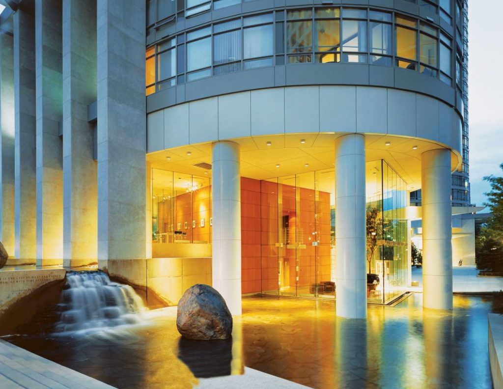
This project consists of two 36-floor towers connected at the street by a series of townhomes. The Residences on Georgia was chosen by the City of Vancouver as “one of the projects completed in the past decade which have made significant contributions to the urban design of their respective precincts or neighbourhoods and enhanced the city’s emerging form.” Along with demonstrating lasting design values, Residences on Georgia was also executed particularly well. It was built in just 19 months and on budget by the Ledcor Group of Companies working with Bruce Tidball, despite the complexity of construct-ing around a heritage building on site. This development also featured one of the most successful residential marketing campaigns ever conducted in Vancouver by our frequent collaborator Bob Rennie. Another project with our biggest champion Hock Meng Heah, my family and I lived here for almost five years. I still miss it sometimes.
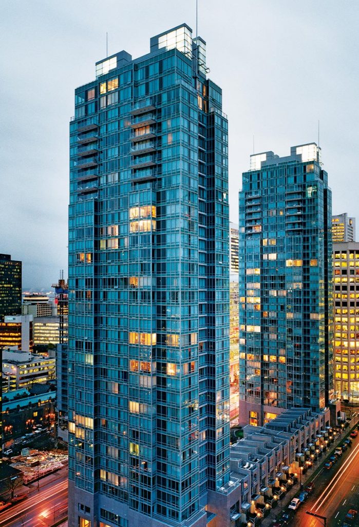
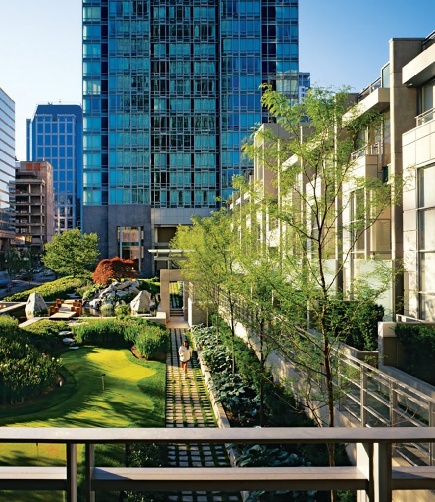
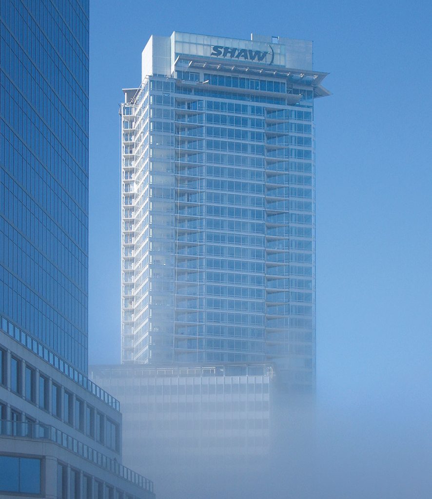
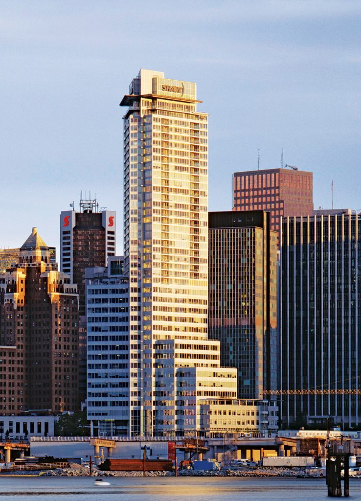
Now 13 years old, this mixed-use development is still among the tallest buildings in the city at 489 feet, comprised of 24 stories of luxury condominiums with a unique live/work zoning designation, on top of a 16-storey office building. Situated on Coal Harbour and adjacent to Harbour Green Park, the Vancouver Convention Centre and extension of Vancouver’s famous Seawall, it perhaps even more importantly forms one half of our little Thurlow to Burrard campus. I really think of this large block as one site and at any given time always have at least one project on going to keep improving upon it. I am fortunate my partners have let me play, and I believe that we have created something very special here, including on a square foot basis probably the most valuable office building in the country.
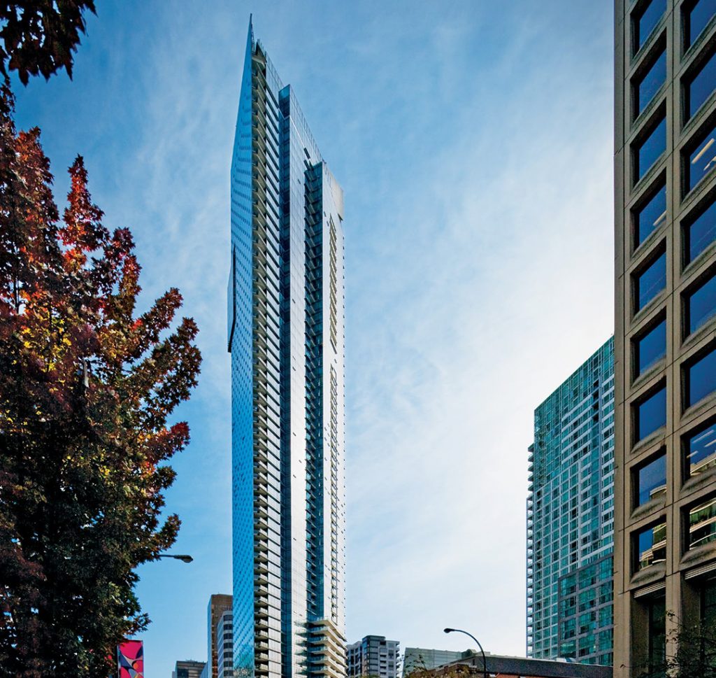
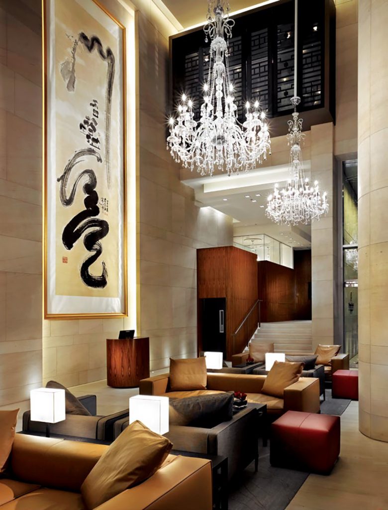
A number of our buildings have had a significant impact on Vancouver’s skyline. No more so than Shangri-La Vancouver. Standing a third taller than the next tallest tower at 646 feet on completion, the Shangri-La was a huge team effort over seven years from design to completion. There were many doubters along the way but our little dream team of Ben, Avtar, Terry, Jim, Bob and Westbank just put our heads down and built arguably one of our best pieces of work. Now over 10 years old, I am as happy walking by it today as when it was brand new. Having recently completed the renovation of the Shangri-La Toronto Lobby and the Fairmont Pacific Rim Hotel’s lobby and Gold Lounge, over the next couple of years we will conduct a significant renovation of the public areas of the Shangri-La Vancouver, again with Jim Cheng. Amongst the many strengths of this project carried out with our frequent partner Peterson Group, is our ongoing collaboration with the Vancouver Art Gallery - offsite. Effectively the ground plane of Shangri-La goes through a metamorphosis with new public art every six months, keeping Shangri-La Vancouver relevant and engaging.
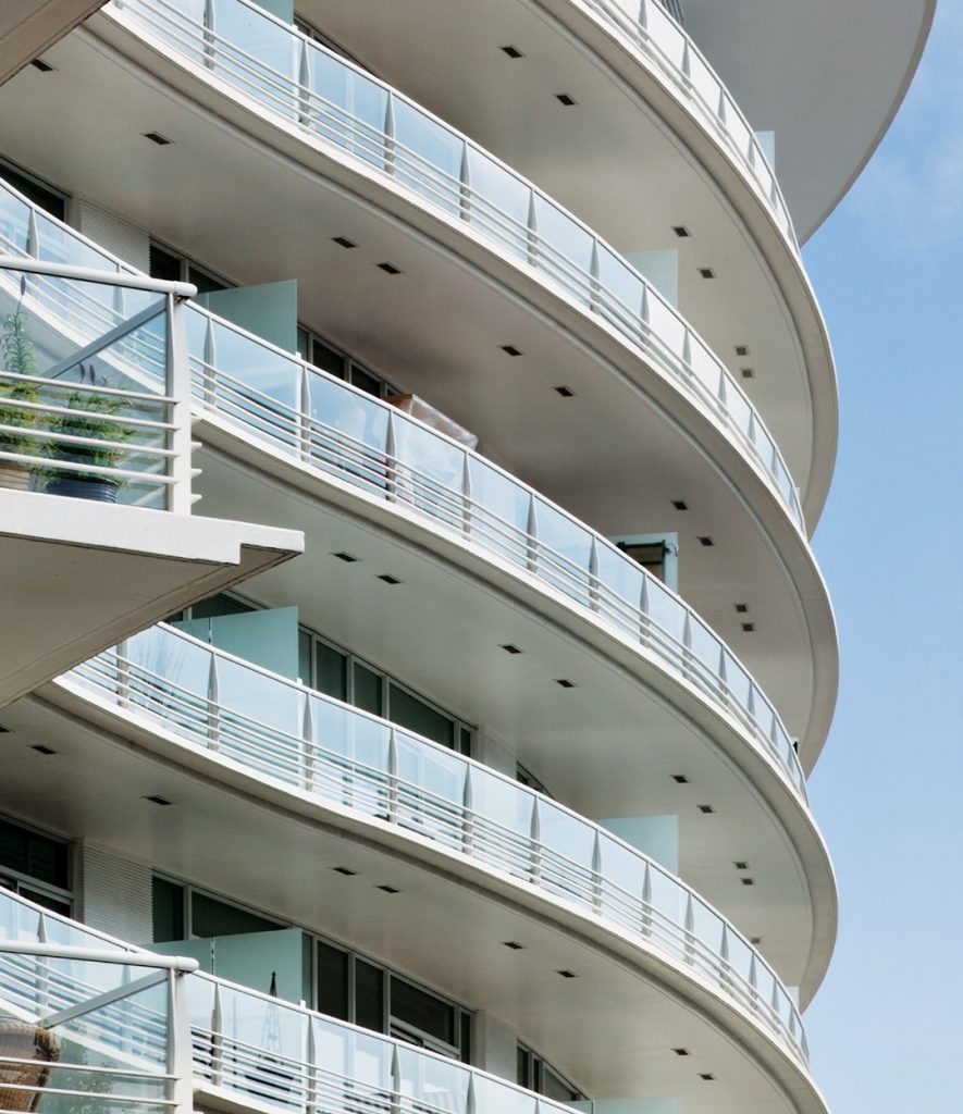
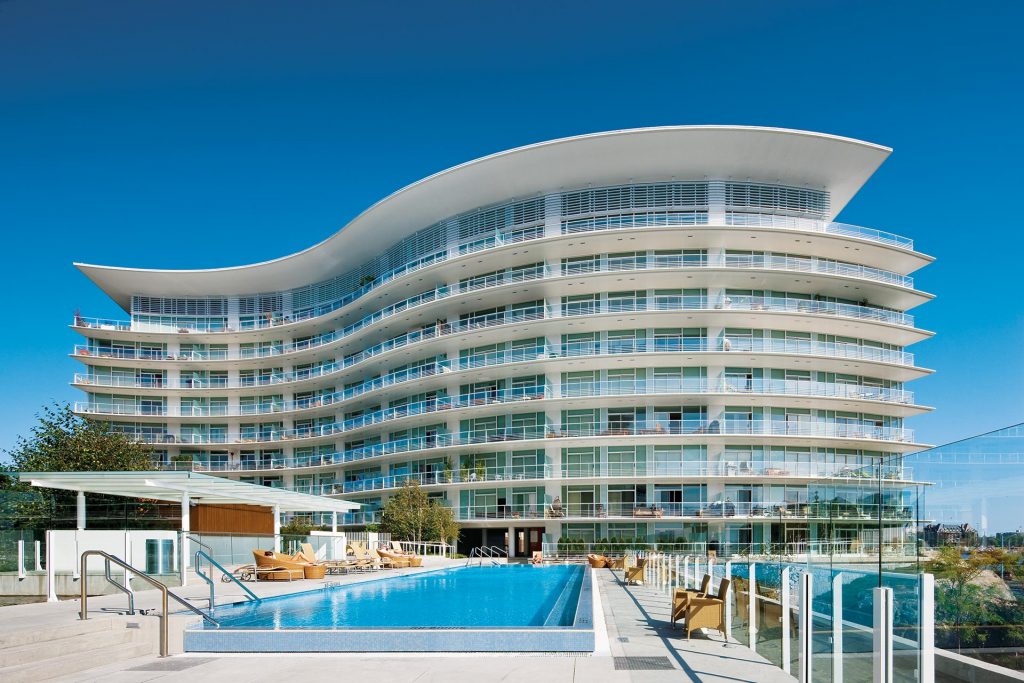
Near the water’s edge in Victoria, Shutters Spa & Residences is the most striking project that we have completed in Victoria. Designed by James KM Cheng, this 185-unit residential development introduces resort lifestyle living into a contemporary luxury condominium setting, epitomized by abundant landscaping, lagoons and architectural features, such as a two-storey waterfall and porte-cochère, exposed elevators and spa amenities. Comprised of two curvilinear buildings of six and nine storeys, this is still some 9 years on, one of Jim and I’s favourite projects. It is just really beautiful.
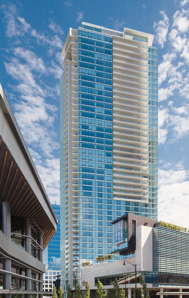
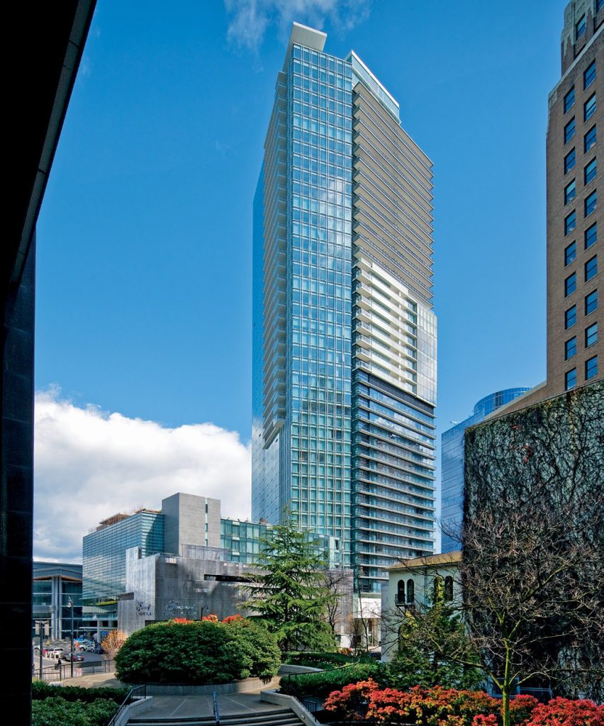
In the summer of 2006, Westbank and Peterson commenced construction on one of the last remaining development sites in Coal Harbour. The Fairmont Pacific Rim hotel, now considered the finest hotel in Canada, opened in time to host the 2010 Winter Olympics. This project consists of a 377-room hotel which the partnership continues to own, and 175 luxury residential homes which at the time sold for the highest prices ever achieved in Canada. Amongst many challenges this is by a wide margin the largest high rise in terms of area, ever constructed in Vancouver and architect James Cheng did a masterful job in breaking down the massing of the building. Together with the integration of Liam Gillick's public art piece, lying on top of a building the clouds looked no nearer than when I was lying on the street, into the facade the build-ing is proof that intelligent ideas can solve architectural challenges. Now nearly seven years old, we continually renovate to layer on art and culture. With at least a dozen projects ongoing at any one time, our ulti-mate goal is that our hotel be regarded as one of the finest urban hotels in the world.
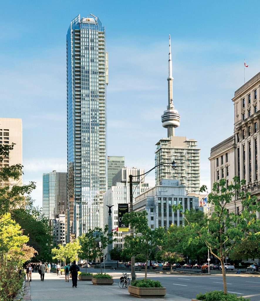
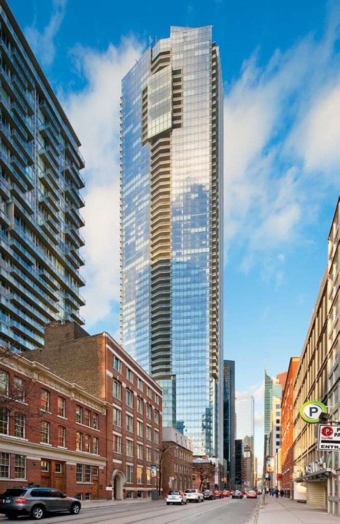
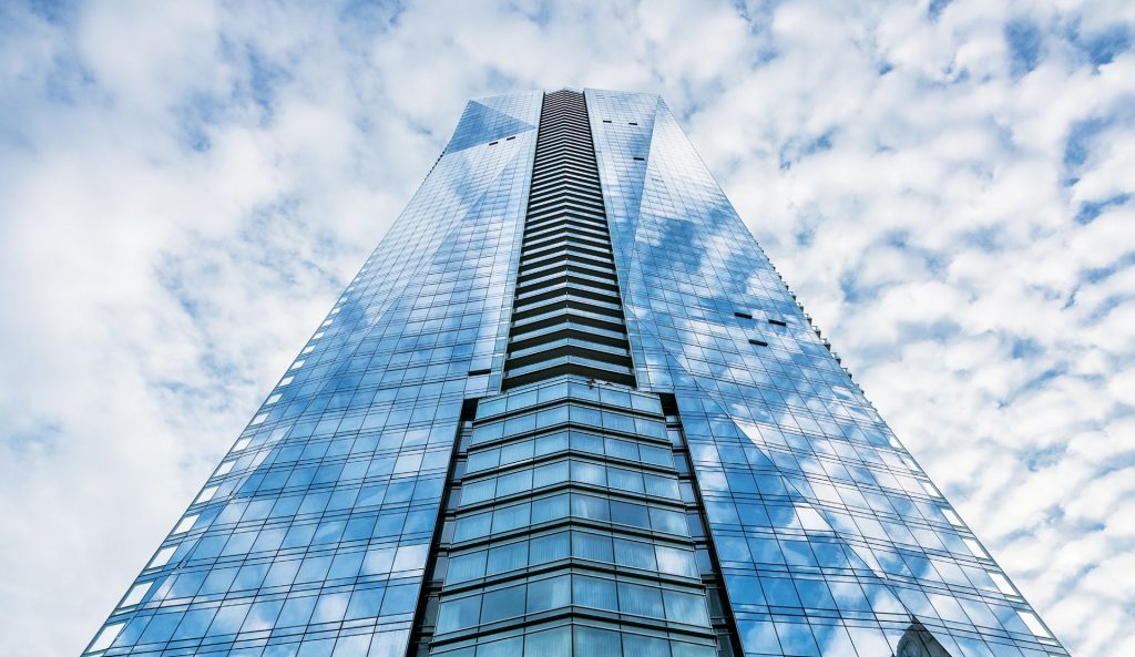
Our first foray into the Toronto market, this 705-foot tower features a 202-room Shangri-La Hotel and 395 luxury residential condominiums, located on University Avenue, Toronto’s ceremonial avenue. Constructed in the midst of the 2008/9 Great Recession, with all the usual challenges of a project this large and complex, add in the financial stress of this near meltdown and it was an incredible feat by Judy to keep this all together. On the border between the entertainment and financial districts, these homes enjoy the convenience and vibrancy of urban living with the services of the 5-star Shangri-La Hotel, which was chosen in 2014 by Wallpaper Maga-zine as the top Urban Hotel in the world. The project offers owners and hotel guests a host of amenities including a lap pool with hot tub, sauna and steam room, a spa, fitness centre, function spaces and specialty restaurants, one of which is Momofuku, a three-storey and tri-concept restaurant by lauded New York chef, David Chang. The 67-storey tower has a folding façade that recognizes the ceremonial nature of University Avenue while elegantly articulating the various uses within the building. The tower is anchored on both ends by three-storey glass cubes to showcase the specialty restaurant and event spaces. In 2012, we entered into a collaboration with the Art Gallery of Ontario to curate the public art on Shangri-La Toronto which led to the commission being awarded to artist Zhang Huan of Shanghai. His piece, titled Rising, is a grand public gesture which extends its presence within the hotel and up the facade. Similar to the Pacific Rim, the original partners Westbank and Peterson again continue to own the hotel, with a long term goal of continual refinement and layering on of art and culture, in an effort to establish the hotel as amongst the best urban hotels in the world.
 James Cheng’s designs have catalyzed the growth of Vancouver’s built environment for decades, and now with First Light for Westbank, he is set to do the same for Seattle. The signature architecture of downtown Vancouver – thin high-rise residential towers atop a podium of townhouses at street level – was invented with his entire block redevelopment at 888 Beach. James K.M. Cheng Architects is a collaborative architecture & urban design practice that prides itself on creating meaningful and dynamic built environments. Based in Vancouver, Canada, our firm is recognized for its pioneering contribution to west coast architecture and city building. Founded by James Cheng in 1978, our 30-person practice has grown to specialize in a variety of scales, with a strong emphasis on the integration of Urban Design, Landscape Design, Architectural Design, and Interior Design. This ensures projects are carried out comprehensively from start to finish, and from exterior to interior. For the past 40 years, we have been committed to crafting high quality and innovative designs. Our portfolio includes local and international master planning, as well as residential, commercial, and institutional projects. The ability to enhance neighbourhoods, communities and basic human experiences has motivated all of our work. James KM Cheng Architects has been recognized with some of Canada’s most prestigious awards, which include the Order of Canada and the Royal Architectural Institute of Canada’s Governor General’s Medal. Local Vancouver projects include: Pacific Centre Redevelopment, Shangri-La Vancouver, Fairmont Pacific Rim, Shaw Tower, Port Moody City Hall, Burnaby Metrotown Library/Civic Square, and River Green in Richmond.