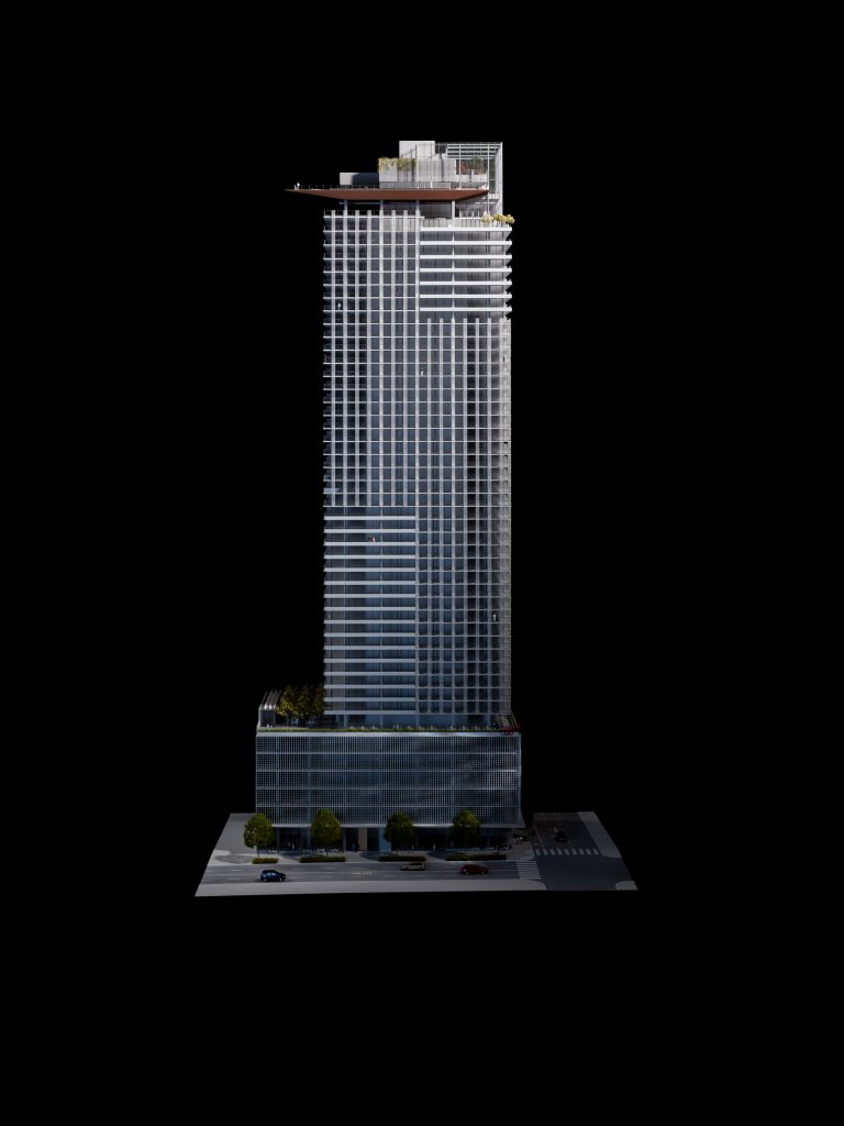
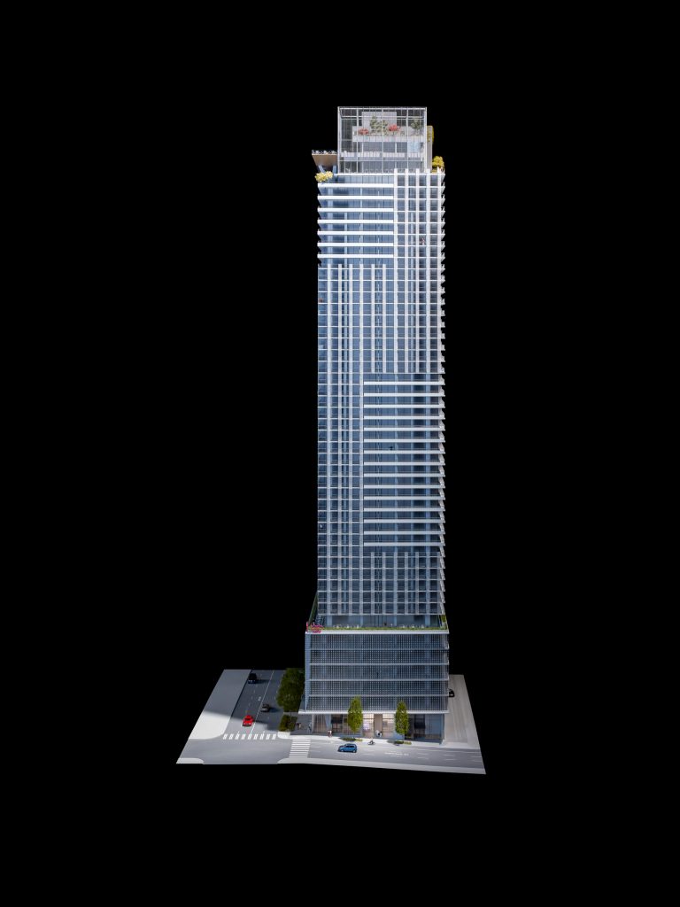
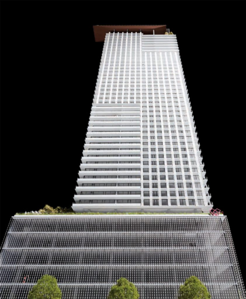
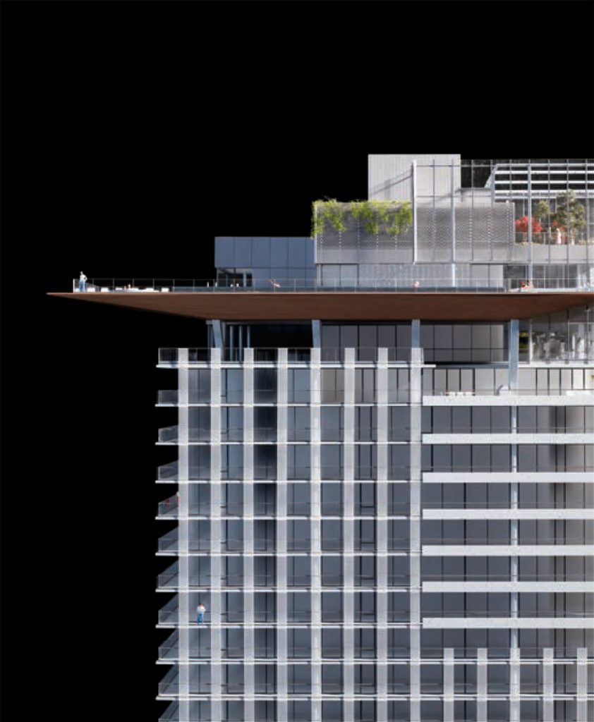
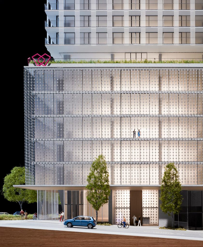
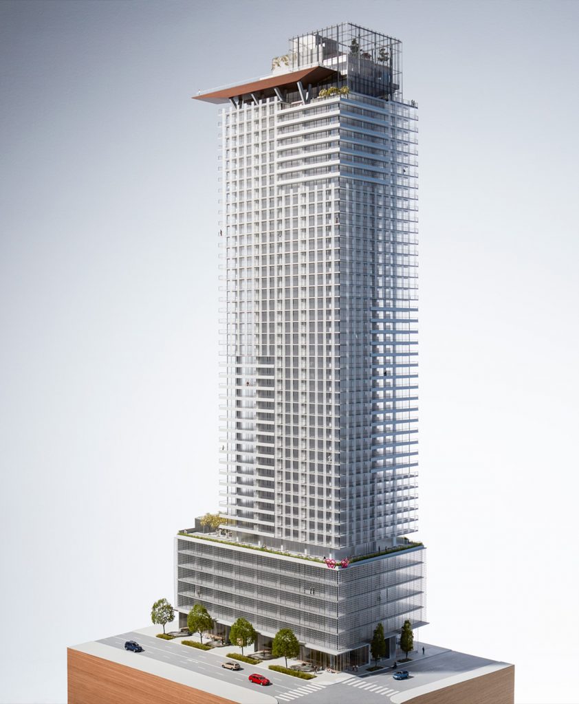
As any painter knows, having the right palette prepared is half the work of art. When Westbank and the interior designers at James KM Cheng architects began the design process for First Light, they started off by asking a series of questions. What is the nature of light here, and which colors are most inspiring under them? How could the textures and details within a new tower build on connections to Seattle’s strong maritime and aviation heritage? How could the finishes and furnishings of the building’s interiors express the sentiment that this is a design for Seattle, and nowhere else?
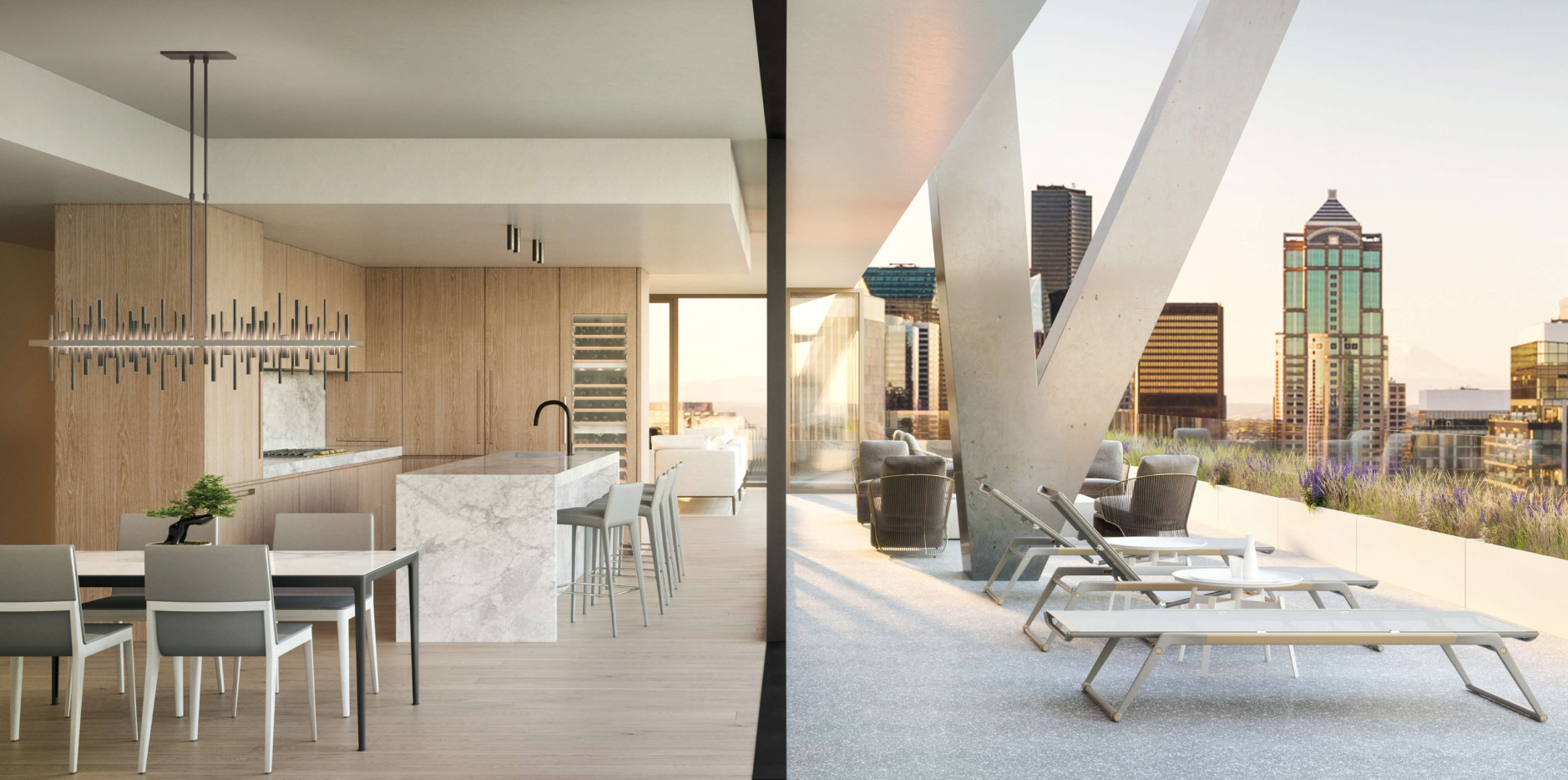
Some of the answers to these questions came together quickly. As a city mainly built in the twentieth century, concrete has long been the construction material of choice for such beloved institutions as the Pike Place Market, high-rise towers, college and university buildings, and the infrastructure of airports and overpasses. The design team decided that concrete building elements should be celebrated, shown with pride in public lobbies, even within private spaces of suites. Moreover, when concrete appears, it should be uncovered and unvarnished – direct and simple. Coupled with the exposed concrete, a rough aggregate warm-toned terrazzo is used as a highlight on some balconies and garden decks, including the lobbies.
The Ship Canal has always been one of Seattle’s most vital spaces, ringed by machine-shops, boat-makers and foundries. The direct and powerful shapes produced by the industrial legacy of areas such as Ballard has inspired the Seattle architecture of Tom Kundig and Steve Badanes, which the design team studied. Seattle’s current astonishing success as a place of corporate creation and innovation arises directly out of these heritages of craft in concrete and metal, so a contemporary look was needed, but one just over the horizon of contemporary taste. In setting a range of colors, James Cheng reminded his team of his mentor Arthur Erickson’s philosophy for buildings in the northwest – that a range of greys, with tiny highlights of color and the framing of nature, would evoke every color in the rainbow under the grey vault of rainy days. Hot colors work in the southwest, and quiet pastels are right for the Midwest, primary colors excel on the bare shores of the arctic and Canadian Maritimes, but a range of greys seems inevitable here, west of the Cascades.
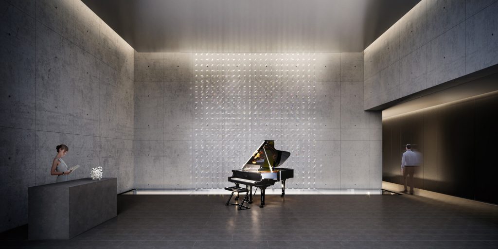
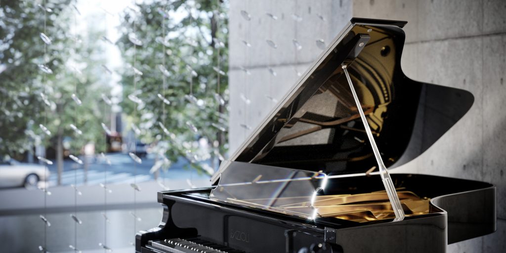
First Light’s residential lobby will have a full time concierge, so there will always be someone to welcome you. The centerpiece of the room will be the latest in a series of custom pianos Westbank has created in collaboration with Italian manufacturer Fazioli, the makers of the finest pianos in the world. For a half dozen major buildings, the developer has commissioned their architects to design a piano that responds to the typology of their architecture, an original design evoking the forms and material palette of the building. These are more than sculptural artworks, they are all fully functional musical instruments. Designed by John Hogan, the piano at First Light will be a work of art, but even more, it will build a bridge to a feeling that can only be created by the sound of music. Everyone entering or leaving this lobby will pass by an interior installation of Hogan’s glass art strung on vertical cables.
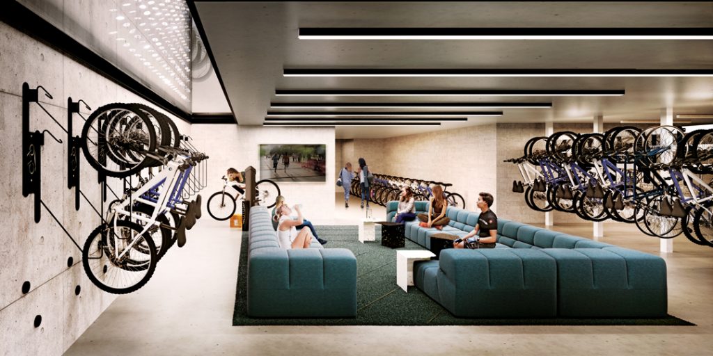
Just in front of the feature wall of Hogan’s artworks will be a detail that demonstrates the new sensibility Westbank asserts at First Light. The floor here will be walkable structural glass panels, allowing views down into the resident’s bicycle room below. Cycling will be an increasingly important mode of transport in our urban centres, particularly as our roads become more accessible. For the residents who will live here, Westbank has decided to invest in their needs, and to visually celebrate it at the heart of the building. Cyclists will enter the building from a special entrance on the lane, and the bike room will include not only secure storage space, but also fully equipped work benches for repairs, even an informal area to hang out before or after a ride. While the residential lobby will have the calm air of an art gallery, the animation of the activity visible below will only enrich the daily lives of residents, whether cyclists or not. In every way, the design for First Light is conceived to enhance every aspect of contemporary downtown living.
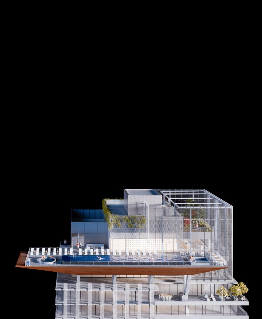
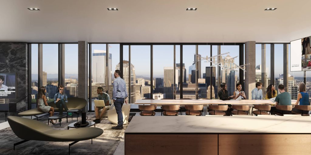
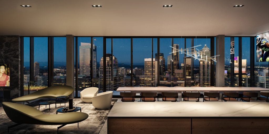
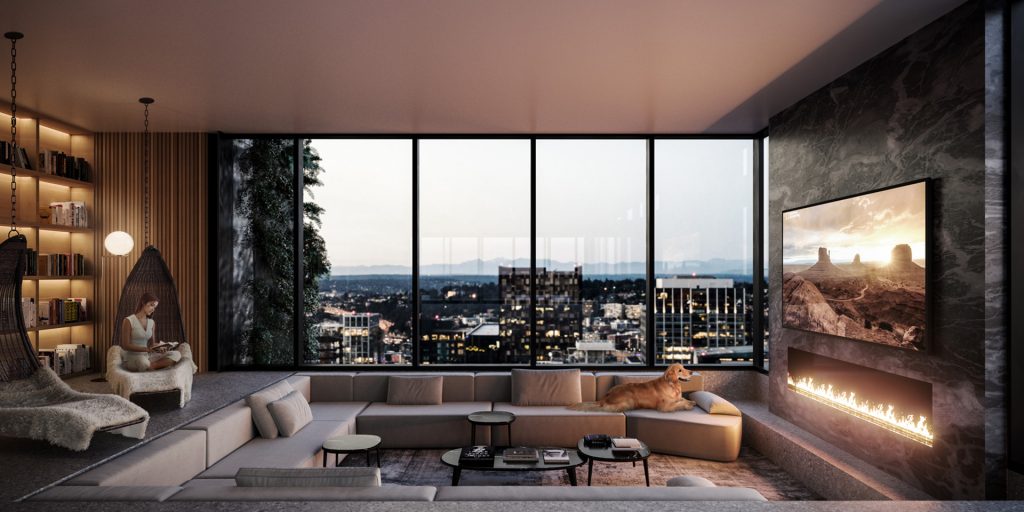
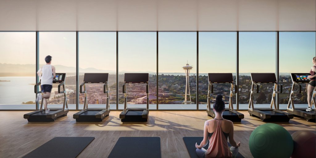
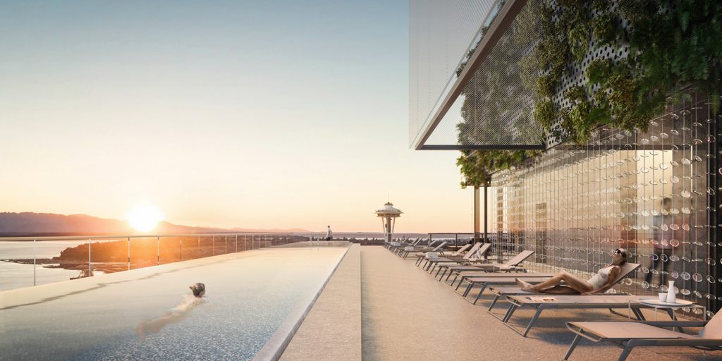
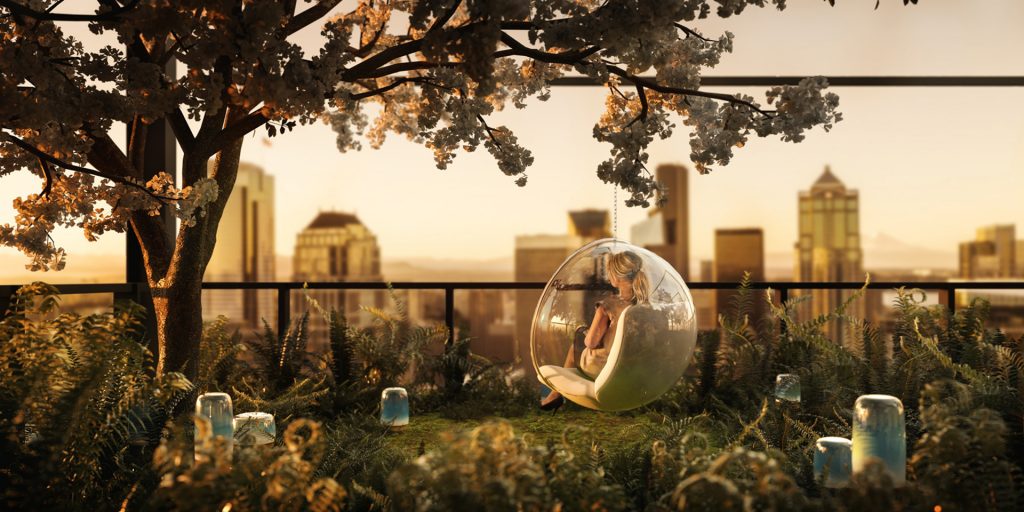
The design philosophy here is quite similar to other portions of the building, where the tempering of light, will frame views with natural elements and a rich palette of earth and grey tones. There will be a range of spaces for the use of residents here, from flex and gathering rooms, and fully-furnished lounge areas. Of course, there will be the active recreation of the lap and spa pool areas up top, with the entire floor below devoted to the aerobic and weights room. Terrazzo decks will be visible through the floor to ceiling glass on all sides of amenity rooms. Lounge chairs, sofas and standing lights will draw on the rich tradition of Italian furniture design, including the essence of Milan’s classic modernist design era from 1960 –1980, but also some contemporary models, curated and manufactured by B&B Italia, the leading Italian company in the international world of designer furniture. Wall surfaces will either be in warm colors suitable to the gatherings they will frame, or else will be simple, textured concrete, a reminder of this tower amidst towers in a fast-growing contemporary city.
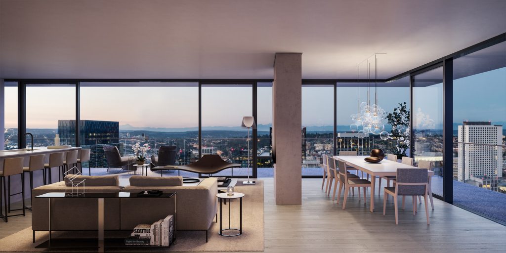
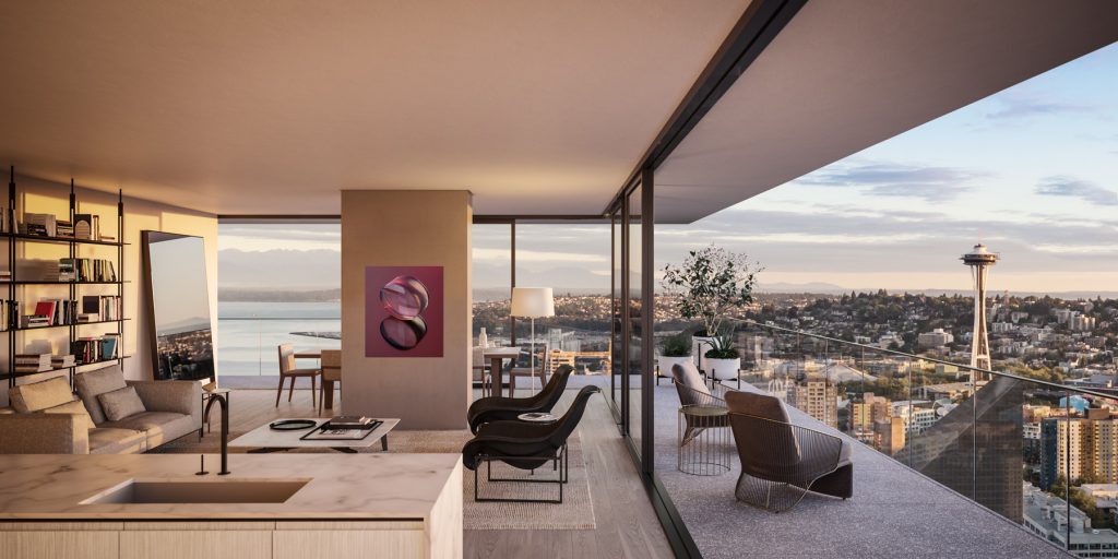
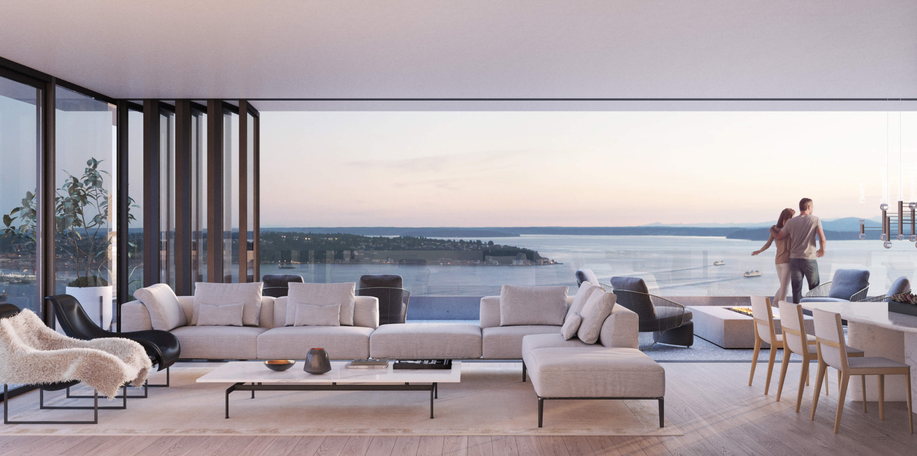
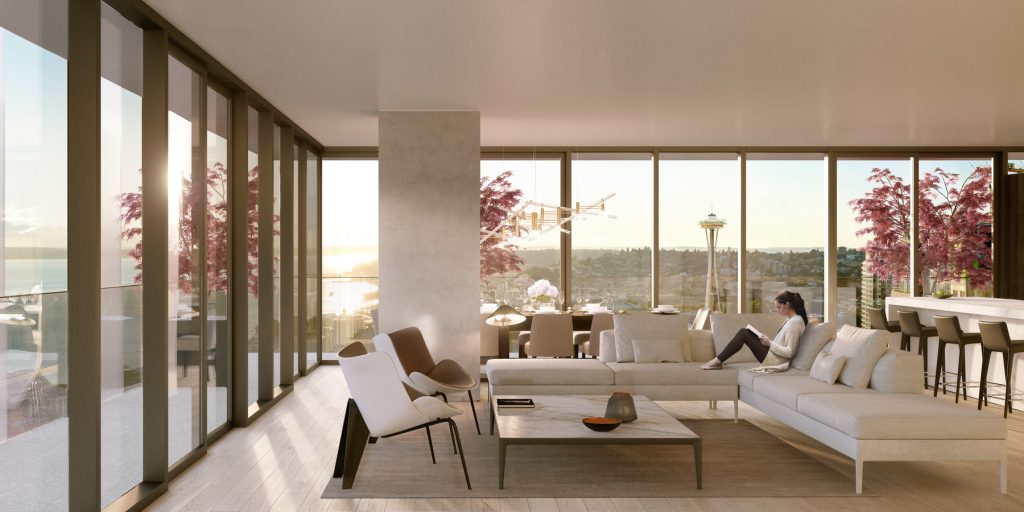
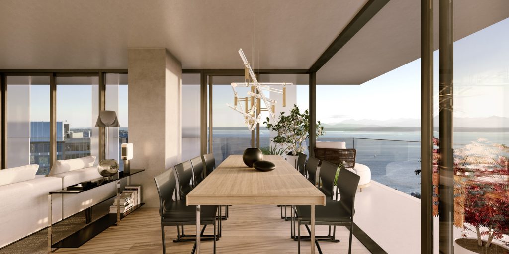
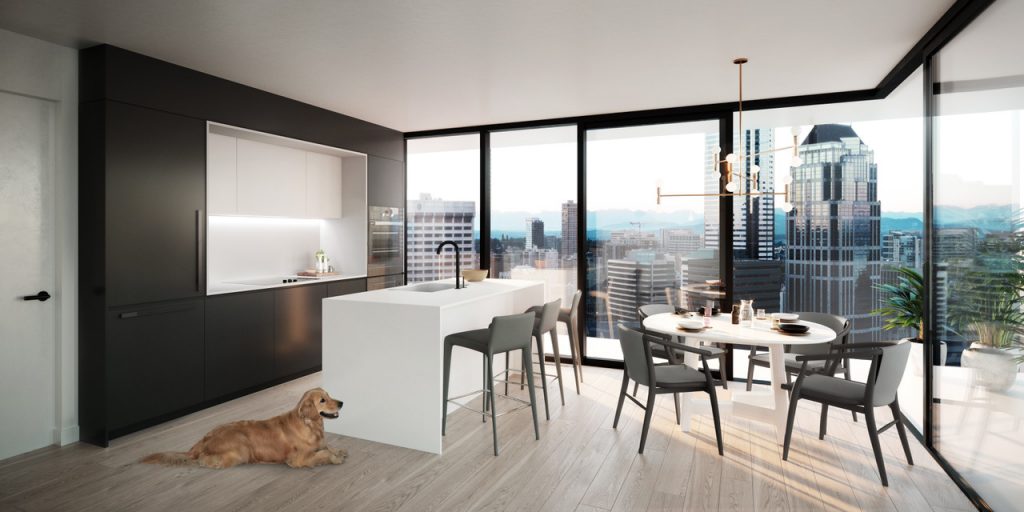
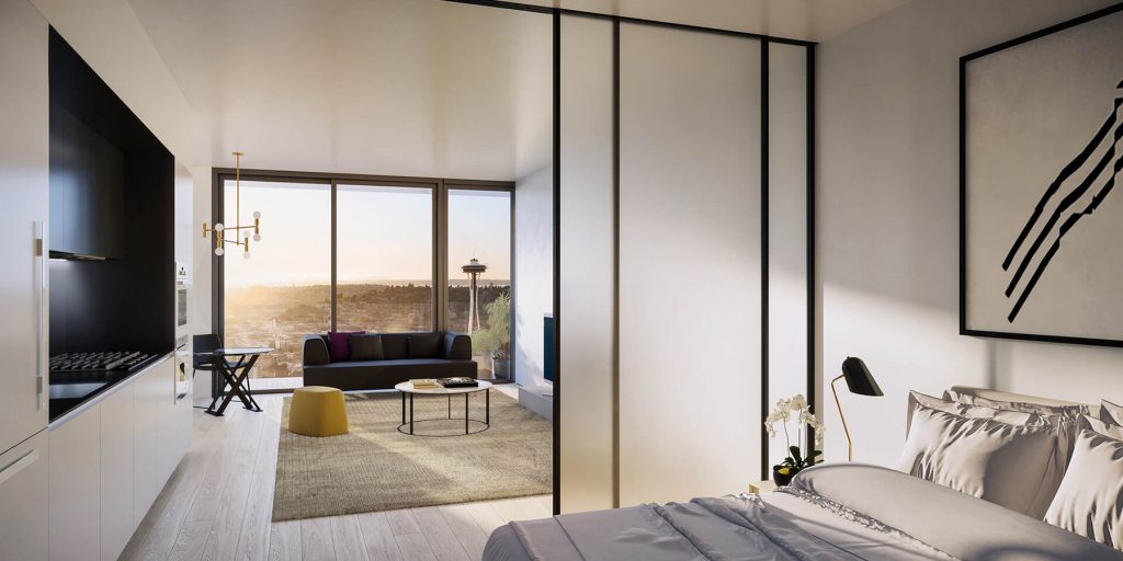
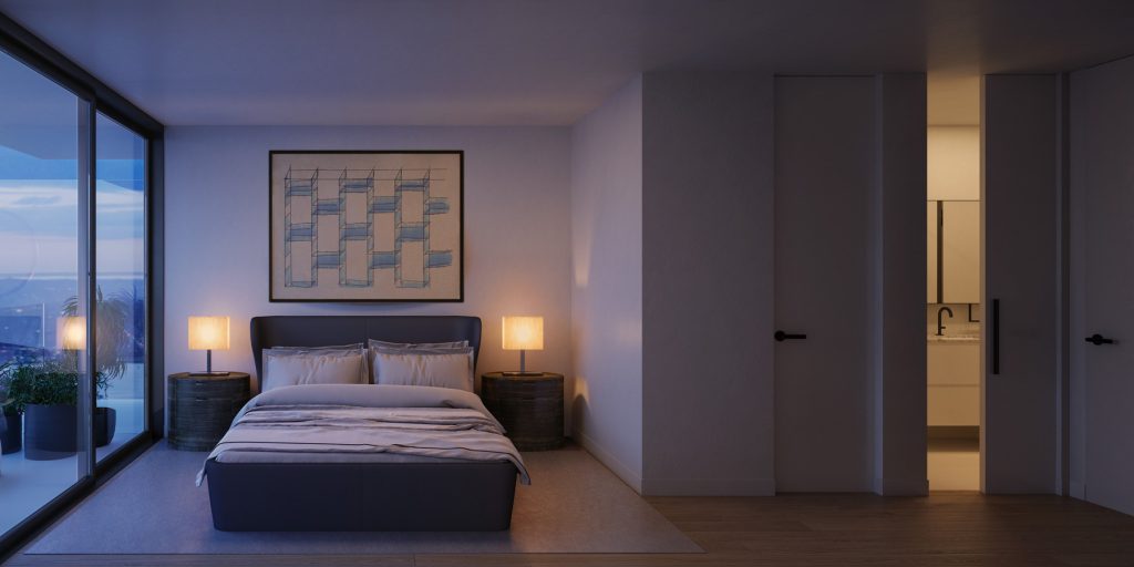
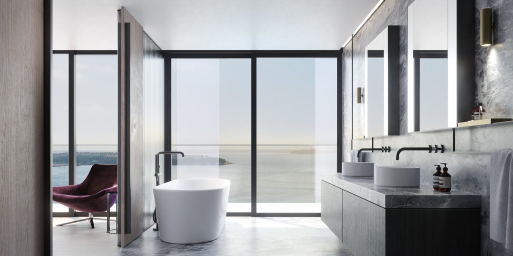
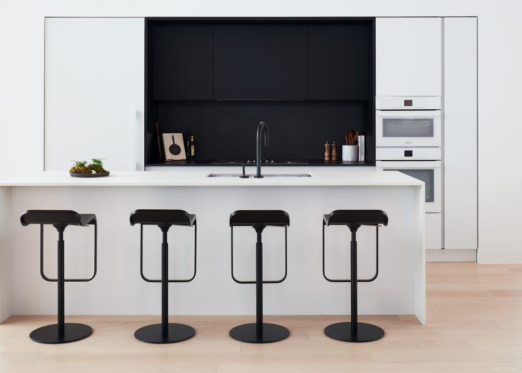
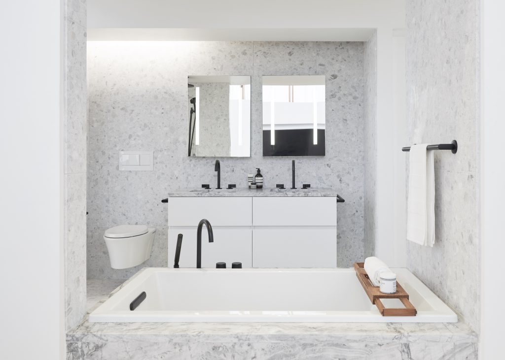
The residential interiors at First Light echo the three core themes of industrial materiality, elevation of craft and purity of design that are expressed throughout the project. The corridors and public spaces of the building are kept simple and pure; with recessed cove lighting along the halls, minimally expressed door frames and fine-grain minimal details, even in such touches as the suite numeral fonts and door finishings. Inside each residential home, a cool, natural palette extends throughout with subtle yet starkly contrasting design details. Residents will be able to choose one of two offerings. The first features raw architectural concrete columns, white oak floors, matte white cabinetry and millwork with black inserts. The second features a matte black lacquered kitchen with white inserts. JKMCA collaborated heavily with a custom kitchen manufacturer from Italy, sourced by leading furniture maker B&B Italia, to achieve a design that reflects the beautiful aesthetic of the homes. The primary washrooms, with integrated Kohler custom plumbing fixtures, will feature terrazzo tile, with the vanity countertop and tub surround in honed Super White quartzite, a frameless glass shower enclosure, luminous-mirror medicine cabinets, matte black hardware and bath accessories (with gold and fluted glass in the penthouse units). Every detail in the residences will express an elevated and sophisticated minimalism; over-height door frames cradle glass partitions and custom matte black finishes and lighting will define these spaces as not only homes but total works of art.
